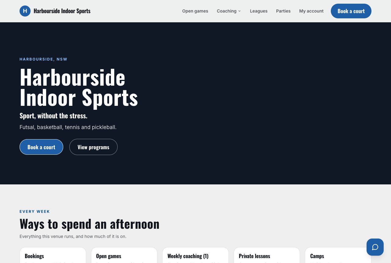
Weekender
Your own photograph and your words up front — your name on your colour until you add one — then the way in to booking. Hours and surfaces sit in the band beneath, never in the headline.
Every Sweepa venue gets a website. Not a blank canvas and not a template with your logo dropped in the corner — one of seven designs, each built for a different kind of venue, each in a light and a dark version.
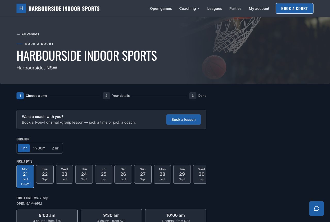
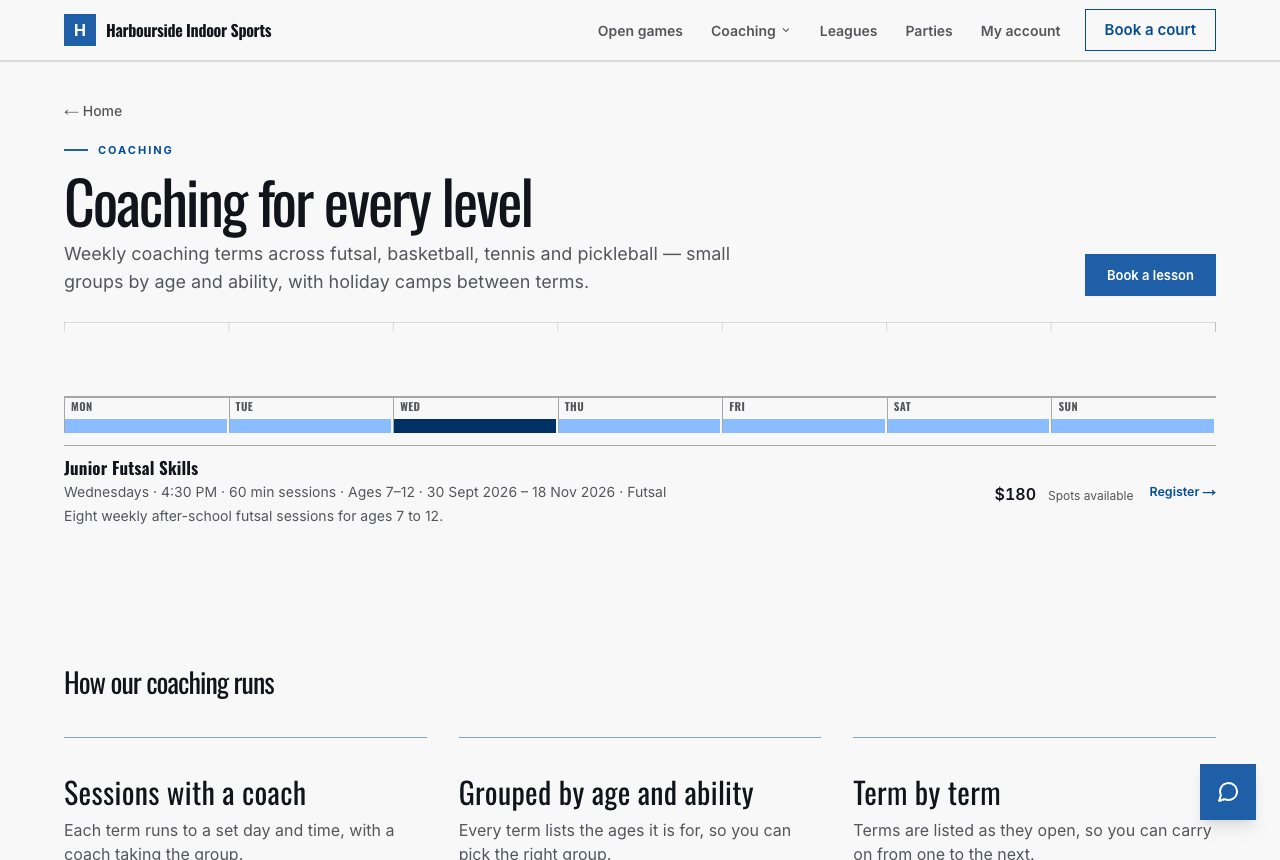
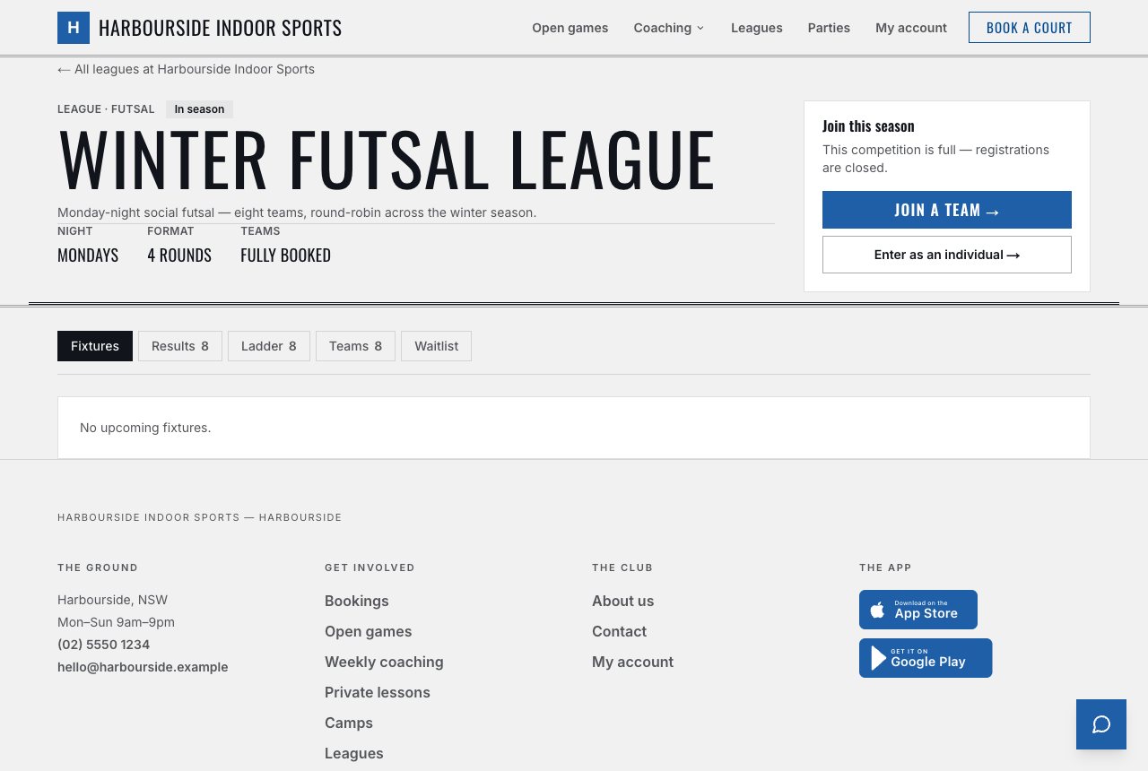
Each design is built around a single organising idea, and it holds on every page — the booking flow, your program listings, your ladders, your contact page.
Your own photograph and your words up front — your name on your colour until you add one — then the way in to booking. Hours and surfaces sit in the band beneath, never in the headline.
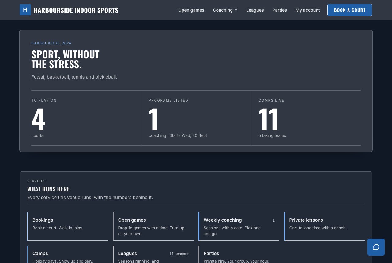
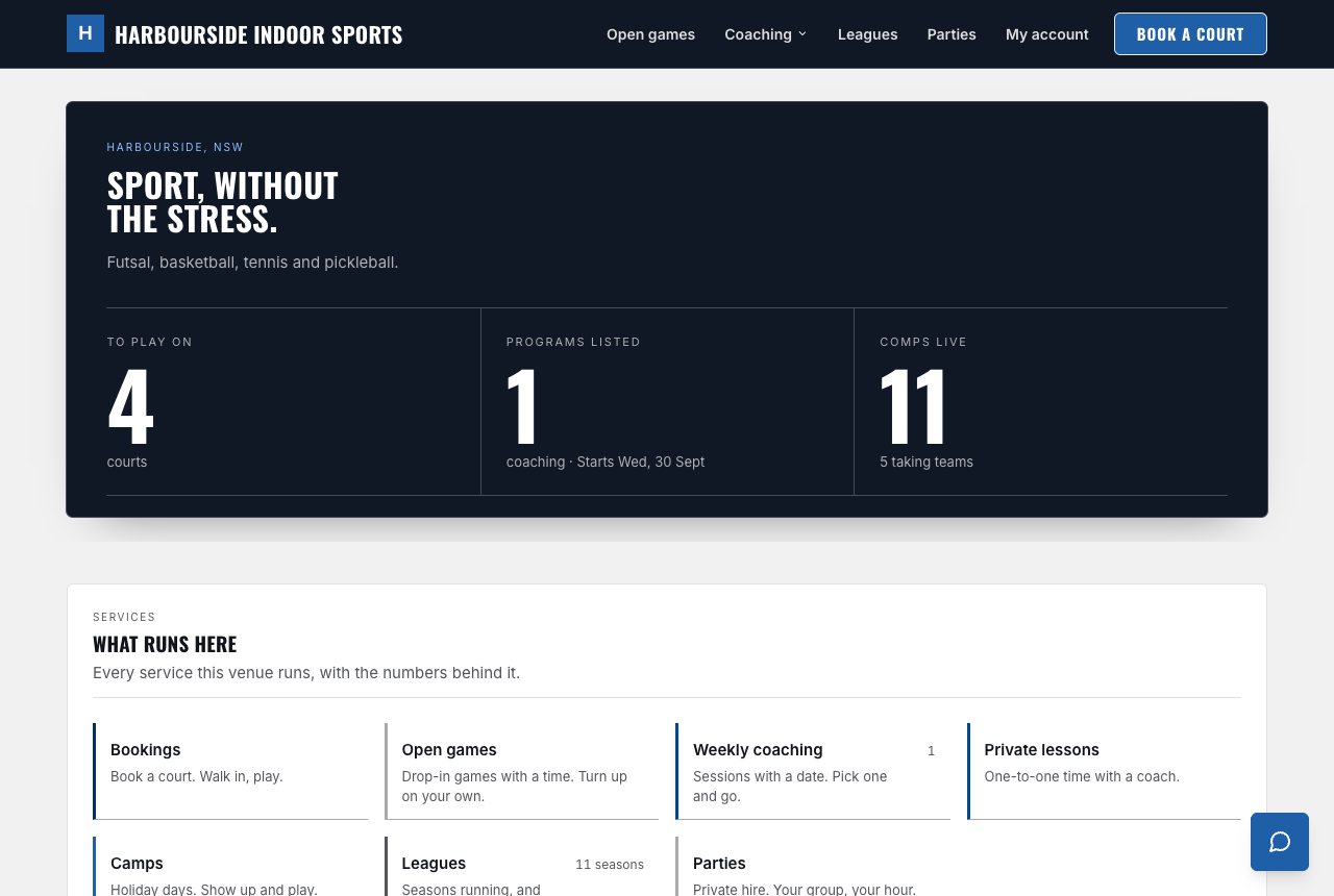
A departure board. Every service a row, every row with an honest status. No photography needed.
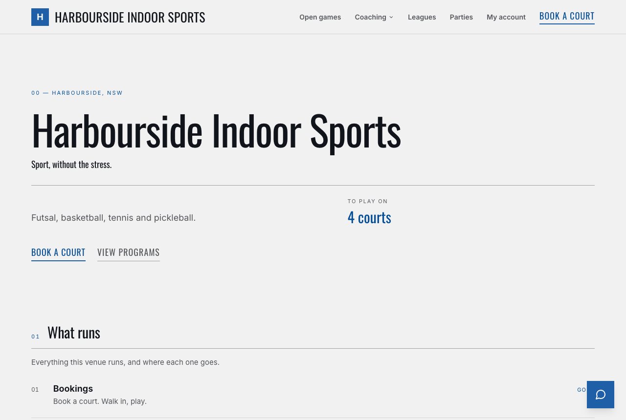
A magazine. Your own photograph as the cover, numbered chapters between hairlines, and one line of yours pulled out large.
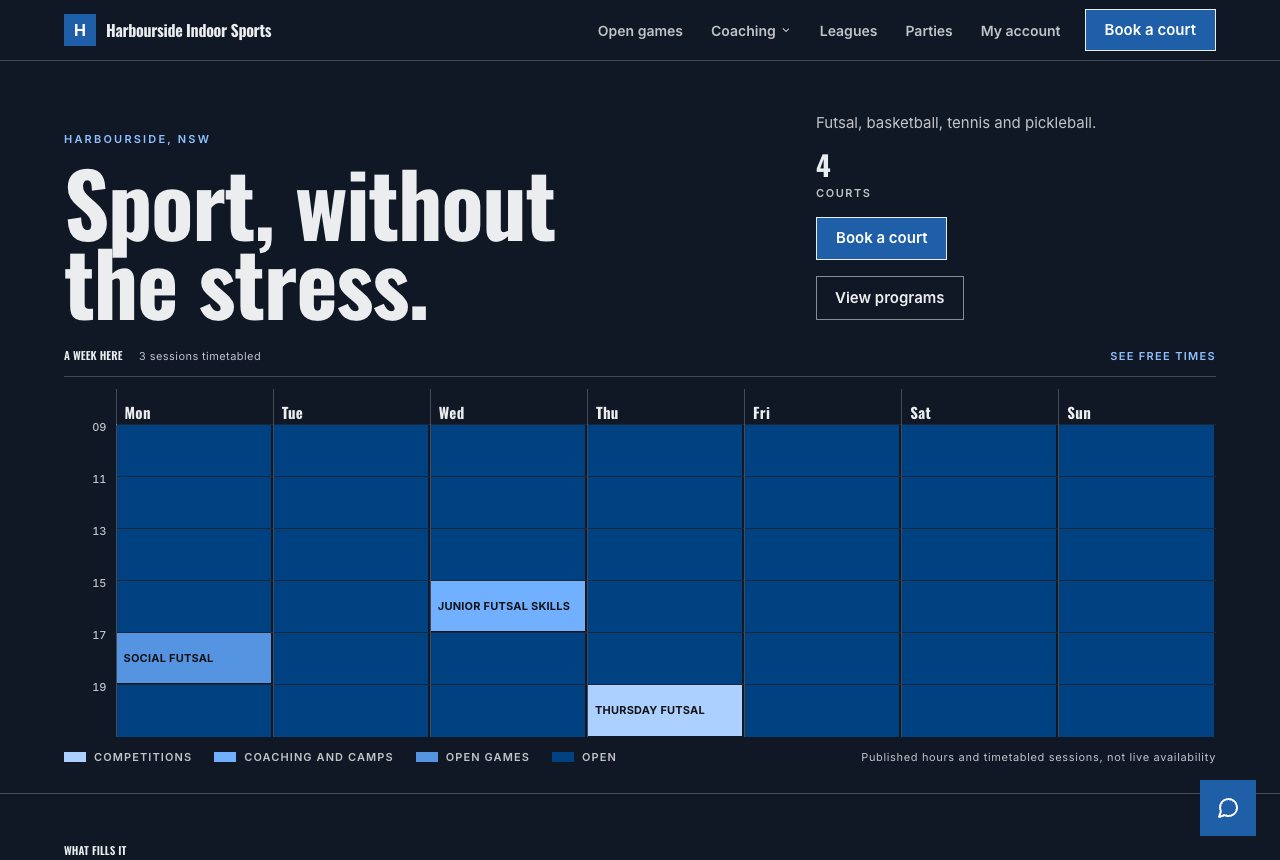
Your week is the page. The shape of a busy Friday is the hero image. No photography needed.
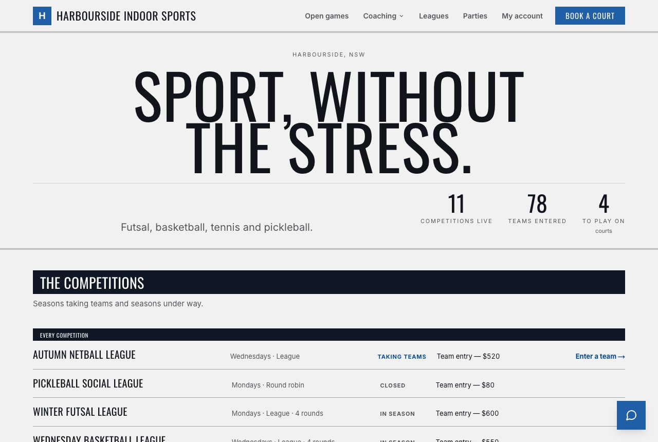
A match programme. Condensed type, ladders and fixtures set the way sport has always set them.
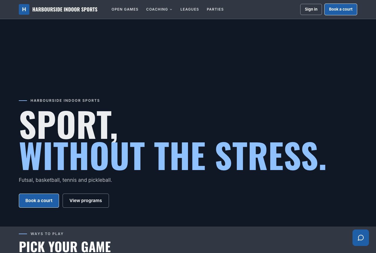
Your grounds and your leagues. A two-tone headline over your own photograph, edge to edge — the sample venue has none, so it opens on the band — then numbered ways to play, and every competition set as a matchday programme.
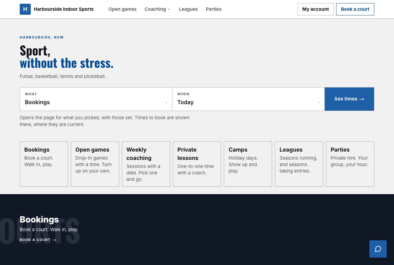
A thing you walk up to and operate. The page opens on a picker — where, what and when — and Go lands on the page that answers it, with nothing claimed on the way. Below, bold blocks over giant type.
None of the seven needs a photo, and none of them opens on a stock one. Board, Editorial, Grid, Fixture and Kiosk look finished without a single photo and use yours when you add them (Kiosk never puts one at the top; yours go behind its blocks). Weekender and Ground are built around your own photograph, and with none they open on your name in your colours, as the samples above do.
Every design on this page is shown for a sample venue, not a customer.
Every design comes in light and dark. Same layout, same type, same structure — the ground changes, the composition doesn’t. Pick the one that suits your room.
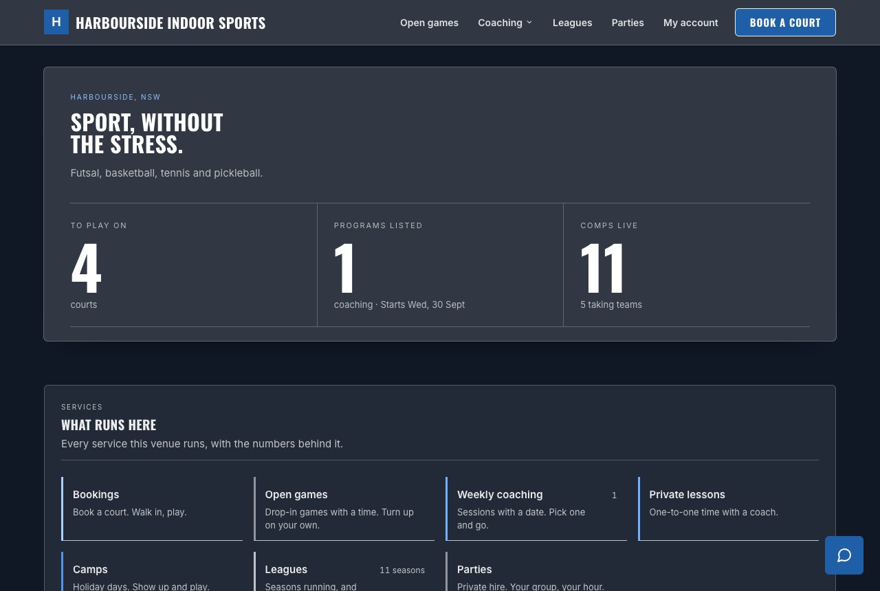
You give us a primary, a secondary, a logo and one of eight font pairings. We work out the rest — the dark ground behind your header, the exact shade a button needs to be, whether text on it should be light or dark. If a colour would land somewhere unreadable, we adjust what’s painted and tell you what changed.
No contrast checker, no brand guidelines, no second-guessing a hex code at 11pm.
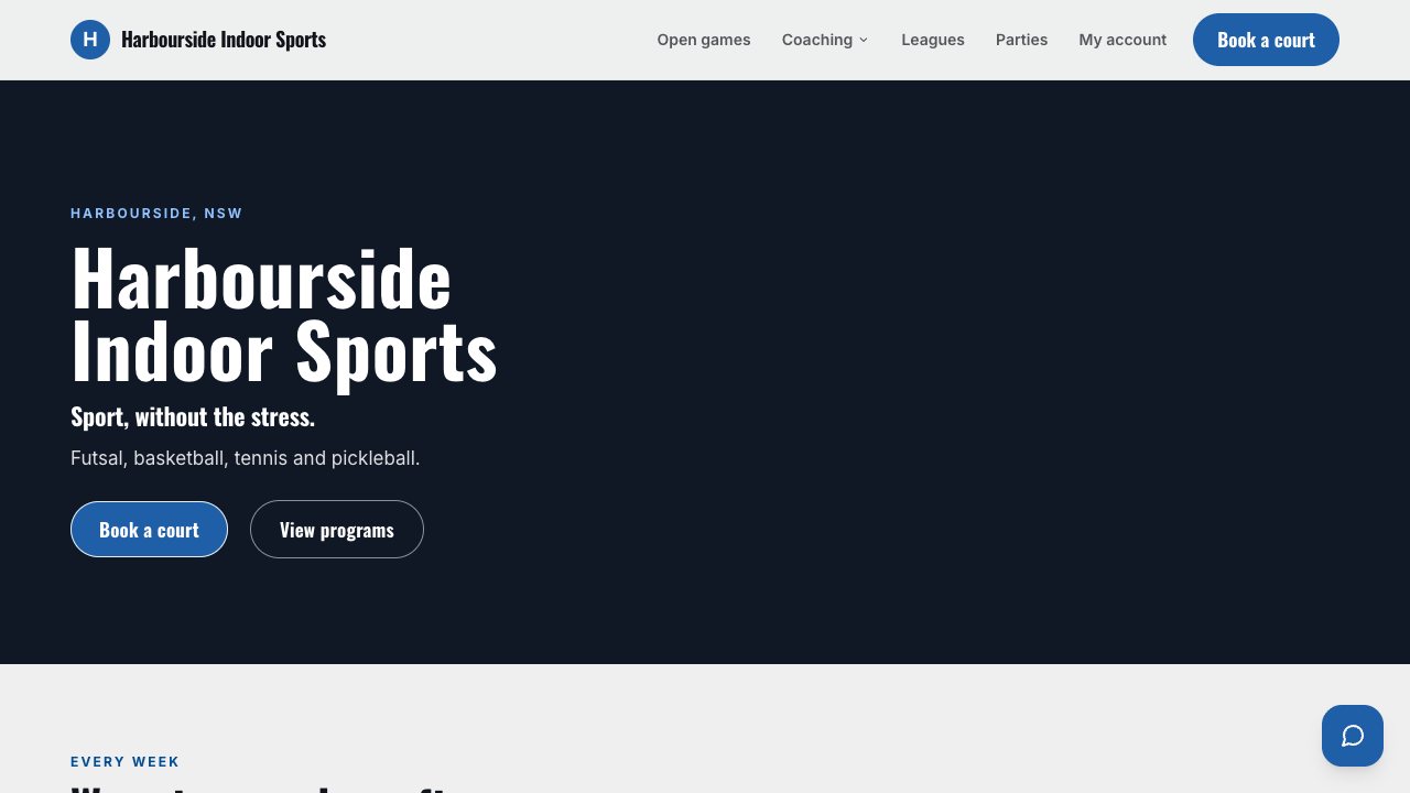
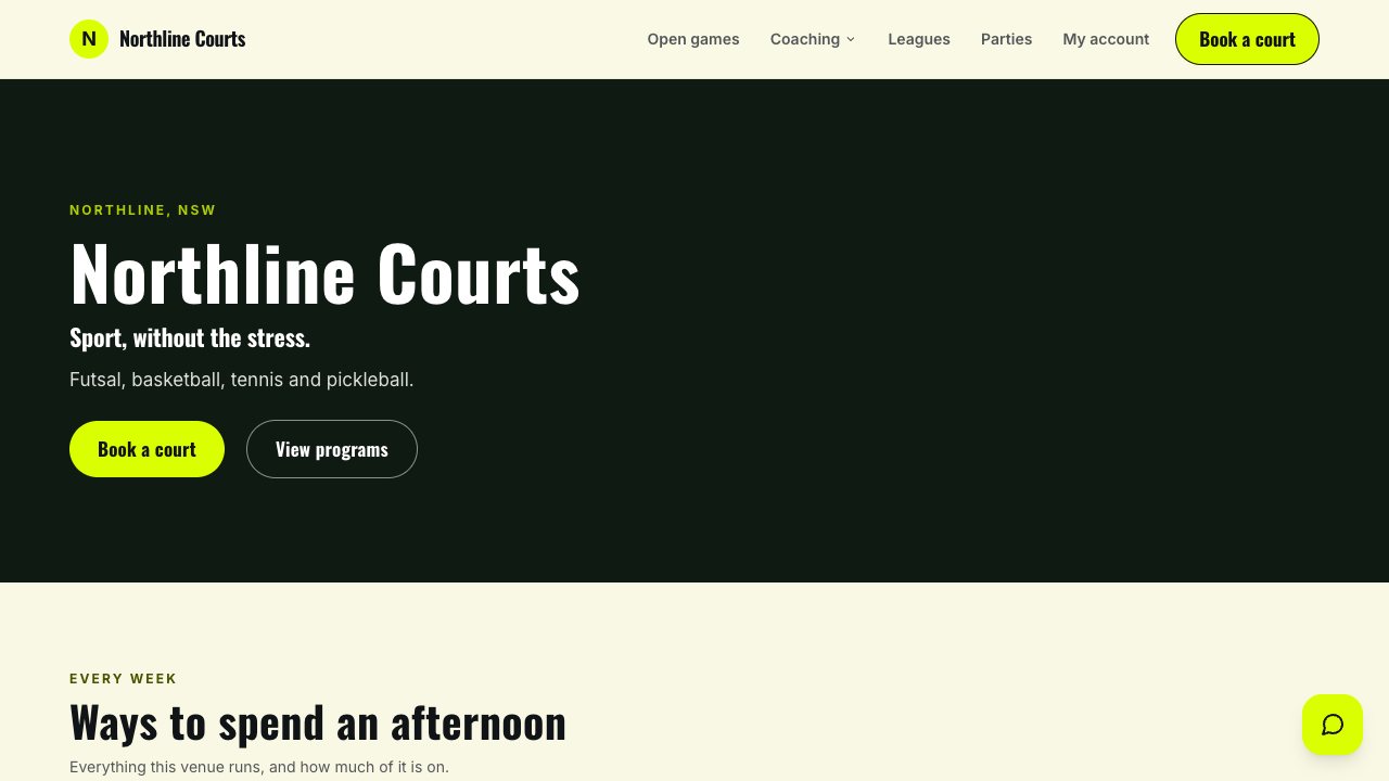
It’s a short list, and it’s the reason you can leave your site alone for a month and trust what it’s telling people.
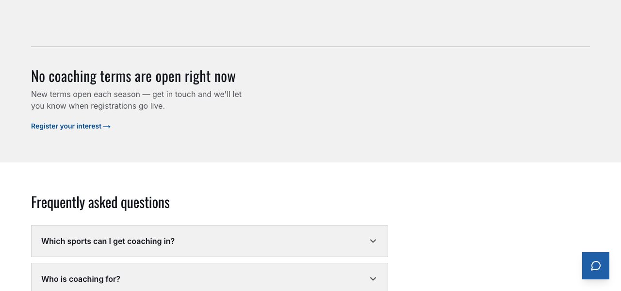
Your booking flow, coaching and league listings, memberships, fixtures and ladders, coaches, locations, contact, legal pages. All of it follows the design you picked. Change your mind in six months and the whole site changes with it.
Pick a design, set your colours, upload a logo. You’ll see it as you choose.